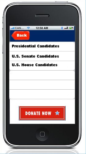
Candidate Menu

Feedback:
Kristen: add a note here that mentions the other candidates and the 6 categories we cover on votesmart.org?
Clinton:
Mike:
Luiz: A list works well here, however the top navigation is outdated according to today's standards, see LinkedIn main menu. To reach that main menu, the user clicks on the icon in the top left. This header changes based on the level of navigation (example). A suggestion would be to also use an ordered list (example, see 'plan vacation in italy' is the divider.) separating "National" from Given State results, or some sort of categorization. "Donate Now" should not be taking most of the screen space.
Carly:
Darren:
Chris L.:
Julia:
Transition: tap to select option, screen slides from right to left
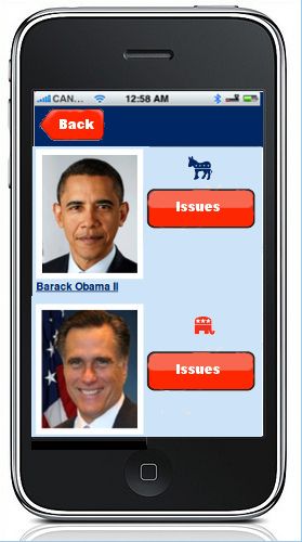
Presidential Candidates

Feedback:
Kristen: all "major" Pres and their associated VP candidates should show here. On the right, we should display % alignment (if no issue questions have been answered, then it could display something a prompt for users to do so), a radial option for "preferred candidate" that users can select and save, and an option to see all of that candidate's issue positions. The candidate detail page can have a summary of other data, issue positions. Also, we don't have icons for 3rd parties and independents, so text will have to do.
Clinton:
Mike:
Luiz: Here I envision the header with "main menu" icon. If we are going to use images of that ratio as oppose to smaller ratio, then I would remove the "Issues" button, since the general idea is to click on the image or item in order to go into that candidate's profile. With this in mind, the area to the right of the image would be populated with relevant data that creates a meaningful snapshot of the candidate. Add an overlay or some visual display indicating what this list represents (example, New Items.)
Carly:
Darren:
Chris L.:
Julia: There's lots of space to the right of the photo that I didn't know what to do with aside from the "Issues" button - we could put a "Track" or "Notify" checkbox to integrate with MyVoteSmart, or a hyperlink to the candidate's website, maybe. (7/2/2012) Candidate contact info could potentially go here.
Transition: swipe to scroll through candidates, tap Issues button to select issues
Answering a PCT Question
[TBD]
Feedback:
Kristen: issue details would be useful here. This is hard to comment on like Luiz says because I don't know how we would even get to this page
Clinton:
Mike:
Luiz: I am not sure how this section of the application is suppose to behave or ultimately accomplish. I will need a bigger picture in order to offer meaningful suggestions. I do think we need to replace check-boxes with buttons.
Carly:
Darren: This gets back to VE discussions with Periscopic from a year ago. Wondering about the need to highlight the PCT itself? This is why we have the green and yellow stripes that you see on the lawn view for each candidate sign in the 2012 VE. This was added as PVS Board and RK felt that the 2010 version of VE didn't sufficiently highlight the PCT. Otherwise, there is no mention of why we have to do the research on candidate issue positions. Although they are coming together, we still think of VE research as being a related, but separate program (a logical extension of the testing process). This was a big sticking point for RK last summer with Periscopic so I just wanted to mention it now. His views may have changed since then, I do not know.
Still kind of wondering if the goal of this is to replicate VE as much as possible, highlight the research done (info published on votesmart.org) as much as possible, or come up with something completely new?
Chris L.:
Julia:So if this is too detailed, we could replace the percentage stuff and submit button with something like "pick another issue"
Go Back